SwiftUIでListの中に入れたButtonをタップした際,リストアイテムがハイライトされて操作フィードバックがほしいのですが,単にListにButtonを入れただけではそうなりません. これは美しくないと思い,色々試行錯誤して望む形を実装できたので,やり方を記録しておきます.
環境
- macOS: 26.6 (Tahoe)
- XCode: 27.0
- iOS: 27.0
通常の方法
以下のようにListにButtonを入れる方法です.
List {
  Section(header: Text("unexpected1: standard way")) {
    Button(action: tap) {
      Text("Button")
    }
  }
}
この方法では,通常のButtonの場合には発生するラベルのハイライトもなく,全く操作フィードバックが発生しません.最悪です. ロングプレスすることではじめてハイライトが発生しますが,通常のタップでハイライトしてほしいです.
(この後のものも)動画では左・中央・右の三箇所をタップし,その後同じように三箇所をロングタップしています.
HStackとborderlessボタンスタイルによる方法
以下のようにHStackとborderlessボタンスタイルを工夫することでフィードバックを発生させる方法です.(URLを記録していなかったのですが,)複数のブログ等でこのやり方を見かけました.
List {
  Section(header: Text("unexpected2: HStack and borderless style solution")) {
    HStack {
      Button(action: tap) {
        Text("Button")
          .frame(maxWidth: .infinity, maxHeight: .infinity, alignment: .leading)
          .contentShape(Rectangle())
      }
      .buttonStyle(.borderless)
    }
  }
}
この方法では,通常のButtonの場合と同じようにラベルのハイライトが発生しますが,リストアイテム全体のハイライトは発生しません.また,ロングタップしてもリストアイテムのハイライトは発生しなくなりました.おしい.
私の解法
HStackとborderlessボタンスタイルによる方法を応用し,以下のように実装しました.
- カスタムのボタンスタイルを定義し,タップ時の色制御を行う
- リストアイテムのコンテンツ(ラベル)の領域をリストアイテム全体に拡大し,ハイライトをリストアイテム自体に適用する
List {
  Section(header: Text("my solution: single")) {
    HStack {
      Button(action: tap) {
        Text("Button")
          .frame(maxWidth: .infinity, maxHeight: .infinity, alignment: .center)
          .contentShape(Rectangle())
      }
      .buttonStyle(ListButtonStyle())
    }
    .listRowInsets(EdgeInsets())
  }
}
struct ListButtonStyle: ButtonStyle {
@Environment(\.isEnabled) var isEnabled
var foregroundColor: Color = .accentColor
func makeBody(configuration: Configuration) -> some View {
configuration.label
.foregroundColor(isEnabled ? foregroundColor : Color(uiColor: .secondaryLabel))
.background(configuration.isPressed ? Color(uiColor: .quaternaryLabel) : .clear)
}
}ラベル色はボタンスタイルでコントロールする必要があるので,ボタンスタイルのプロパティに入れています.
これによって,望むような操作フィードバックが実現できました.
動画にはしていませんが,List内に複数のアイテムがある場合(my solution: multiセクション)も望むとおりに動作しました.
また,ダークモードでも問題なしでした.
課題
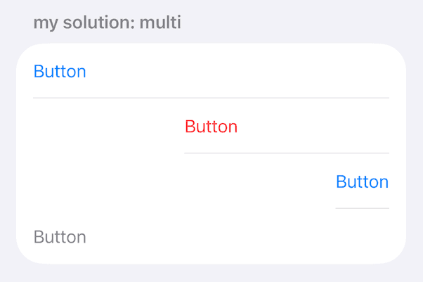
ラベルのアラインメントをleading以外にするとリストアイテムの区切り線がラベルの先頭から始まってしまう問題があったので,
とりあえずalignmentGuideモディファイアで区切り線の開始位置を調整する回避策を取っています.
もっとうまく解決したいです.
HStack {
Button(action: tap) {
Text("Button")
.frame(maxWidth: .infinity, maxHeight: .infinity, alignment: .center)
.contentShape(Rectangle())
.padding()
}
.buttonStyle(ListButtonStyle(foregroundColor: Color(uiColor: .systemRed)))
}
.listRowInsets(EdgeInsets())
.alignmentGuide(.listRowSeparatorLeading) { vd in 16 }.alignmentGuide(.listRowSeparatorLeading) { vd in 16 }を入れない場合,以下のように表示されてしまいます.
余談
このリストアイテムまわりの操作フィードバックはAppleの公式アプリさえ一貫しておらず,例えば同じ「設定」アプリの中においても,ボタンのタップに対してフィードバックがあるものと無いものが混在しています.
動画はAccessibility > VoiceOverにおけるVoiceOver Tutorialボタン(フィードバックがある)とReset VoiceOver Settingsボタン(フィードバックがない)の違いで,後半は0.1倍速にしたものです.
動画だとわかりにくいかもしれませんが,フィードバックの有無は指で操作したときにはかなり違いを感じます.
また,画面遷移についても,タップで即時フィードバックが発生する部分と,画面遷移が始まってからフィードバックが遅れて発生する部分があります.
動画は「設定」アプリのトップでAccessibilityをタップして遷移したときと,その後Display & Text Sizeをタップして遷移したときの違いです.
前者はフィードバックが遅れて発生します.これも,実際に触ると違いを強く感じます.
フィードバックが無かったり遅れて発生するのは美しくないし,ネイティブアプリなりの気持ちよさが失われていると感じます.とても残念です.
コード
このサンプルにおける全体のコードは以下のとおりです.
import SwiftUI
struct ButtonInListExample: View {
var body: some View {
List {
Section(header: Text("unexpected1: standard way")) {
Button(action: tap) {
Text("Button")
}
}
Section(header: Text("unexpected2: HStack and borderless style solution")) {
HStack {
Button(action: tap) {
Text("Button")
.frame(maxWidth: .infinity, maxHeight: .infinity, alignment: .leading)
.contentShape(Rectangle())
}
.buttonStyle(.borderless)
}
}
Section(header: Text("my solution: single")) {
HStack {
Button(action: tap) {
Text("Button")
.frame(maxWidth: .infinity, maxHeight: .infinity, alignment: .center)
.contentShape(Rectangle())
.padding()
}
.buttonStyle(ListButtonStyle())
}
.listRowInsets(EdgeInsets())
}
Section(header: Text("my solution: multi")) {
HStack {
Button(action: tap) {
Text("Button")
.frame(maxWidth: .infinity, maxHeight: .infinity, alignment: .leading)
.contentShape(Rectangle())
.padding()
}
.buttonStyle(ListButtonStyle())
}
.listRowInsets(EdgeInsets())
HStack {
Button(action: tap) {
Text("Button")
.frame(maxWidth: .infinity, maxHeight: .infinity, alignment: .center)
.contentShape(Rectangle())
.padding()
}
.buttonStyle(ListButtonStyle(foregroundColor: Color(uiColor: .systemRed)))
}
.listRowInsets(EdgeInsets())
.alignmentGuide(.listRowSeparatorLeading) { vd in 16 }
HStack {
Button(action: tap) {
Text("Button")
.frame(maxWidth: .infinity, maxHeight: .infinity, alignment: .trailing)
.contentShape(Rectangle())
.padding()
}
.buttonStyle(ListButtonStyle())
}
.listRowInsets(EdgeInsets())
.alignmentGuide(.listRowSeparatorLeading) { vd in 16 }
HStack {
Button(action: tap) {
Text("Button")
.frame(maxWidth: .infinity, maxHeight: .infinity, alignment: .leading)
.contentShape(Rectangle())
.padding()
}
.buttonStyle(ListButtonStyle())
.disabled(true)
}
.listRowInsets(EdgeInsets())
}
}
}
func tap() {
print("taped \(Date().timeIntervalSince1970)")
}
}
struct ListButtonStyle: ButtonStyle {
  @Environment(\.isEnabled) var isEnabled
  var foregroundColor: Color = .accentColor

  func makeBody(configuration: Configuration) -> some View {
    configuration.label
      .foregroundColor(isEnabled ? foregroundColor : Color(uiColor: .secondaryLabel))
      .background(configuration.isPressed ? Color(uiColor: .quaternaryLabel) : .clear)
  }
}
#Preview {
ButtonInListExample()
}